This month’s Theme is an unusual one – Church Interiors.
We invited Richard Sprengler to Guest Judge this months theme. Richard is a Professional Photographer and specialises in Architectural Photography. You can check out Richard’s work via his Website. Thanks very much Richard!
Thanks to all that few that have taken part and congratulations to those who were selected and can be seen in March’s edition of the Algarve Plus Magazine.
The next theme for Algarve Plus we will have to deal with is: “Pets”.
Selected & Published Images
Words of Wisdom:
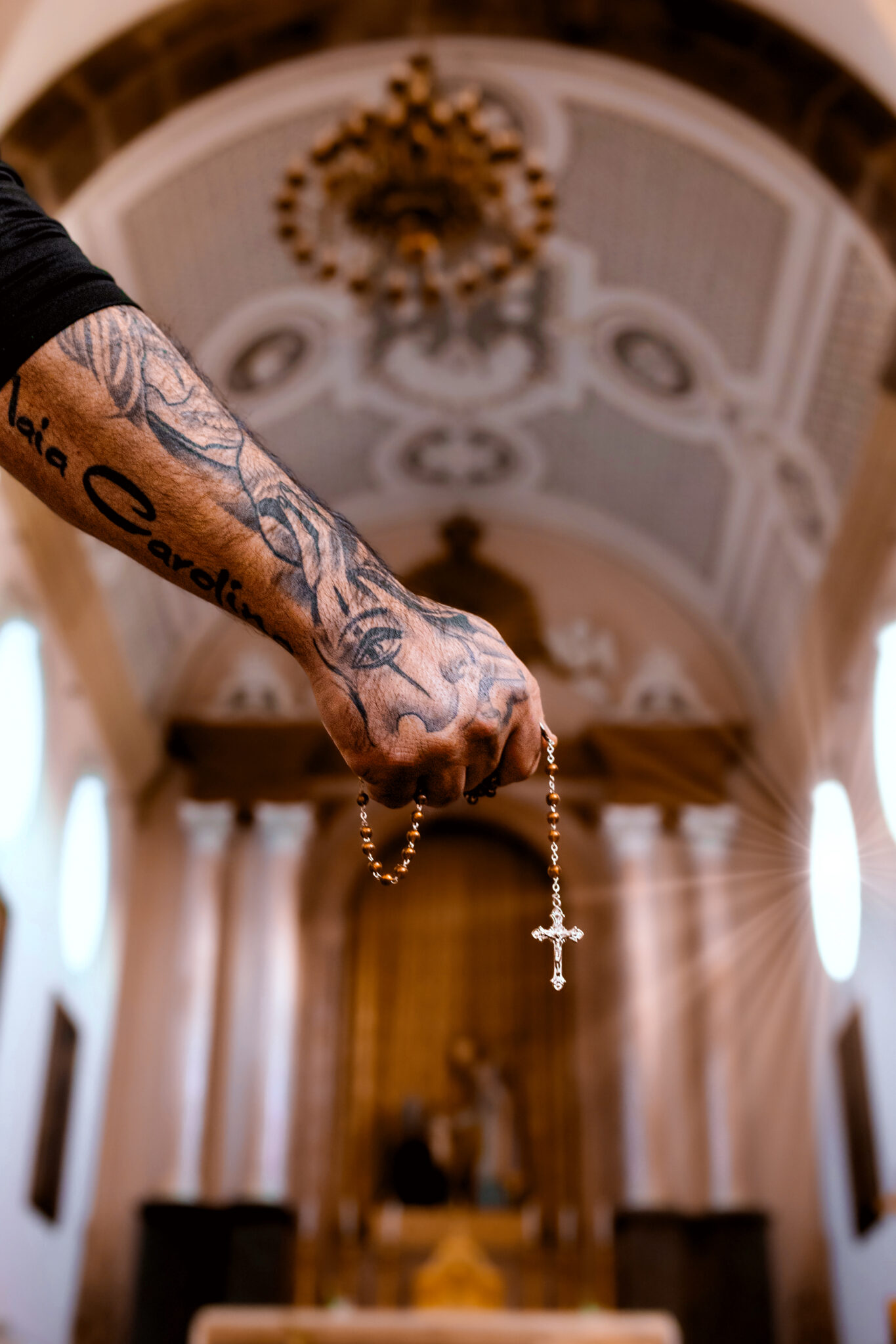
6 Redemption: I chose this one for first place because the photographer was thinking outside of the box. An art museum curator once told me after I showed her my work, “These are nice but show me something different – I’ve seen this before.” I have not seen anything like this photograph before, and it makes me pause and think about what the artist is trying to say and communicate. It holds my attention. A sign of a successful photograph is how long you stop and look at it, before moving on. Of all the entries, this one held my attention the longest
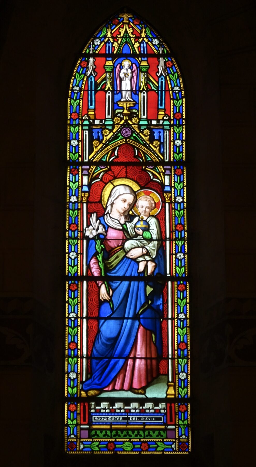
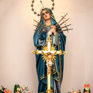
13 Maria: I found this photograph attractive because of its graphic simplicity. I think it could be improved by cropping some of the top off. The 35mm format is long, and I find that verticals are particularly hard to compose because of that. Don’t think that you must stay with that format. I changed my 35mm dslr camera to the 4×5 format because of this.
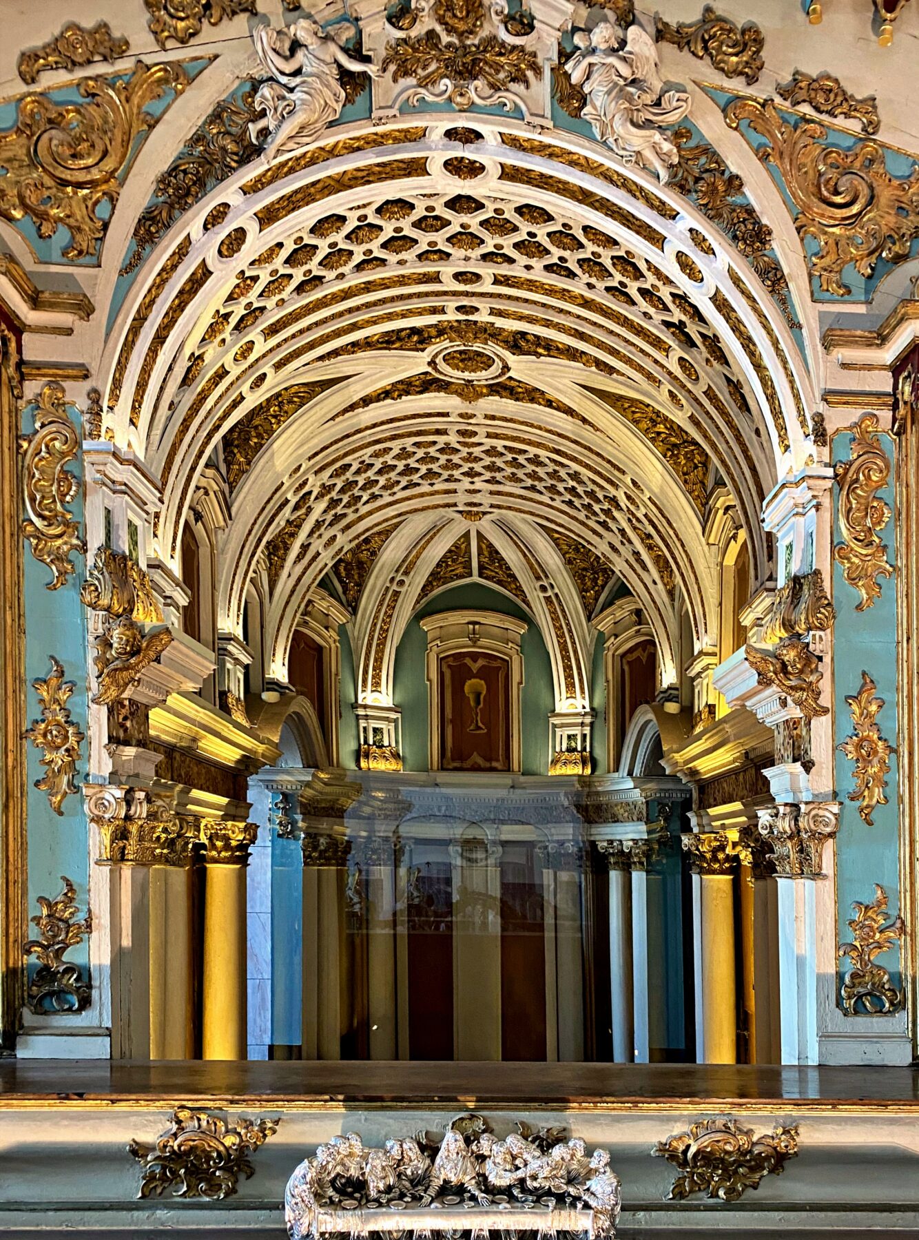
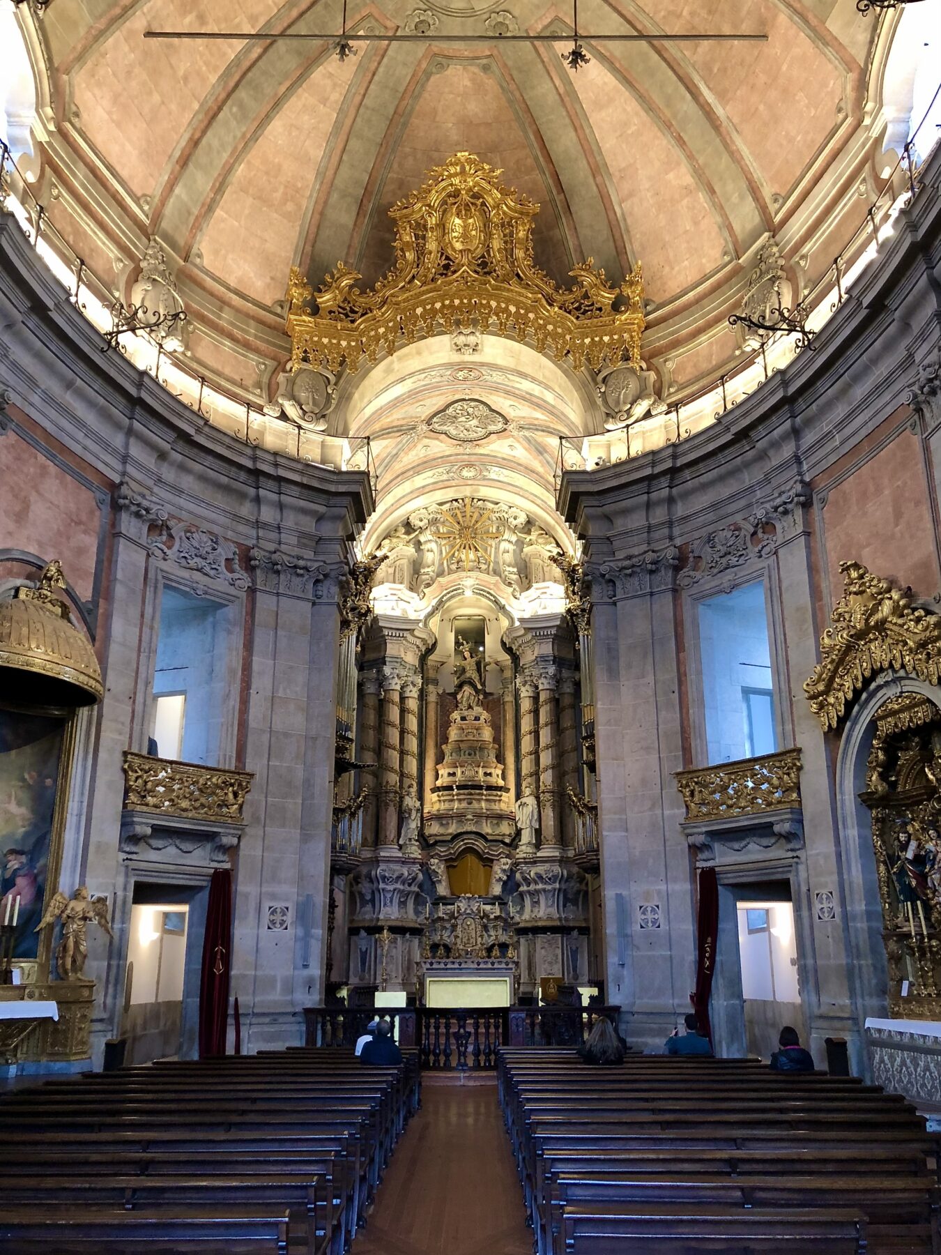
4 Evora Cathedral: This is a very successful photograph and a classic example of a vanishing point composition. There are several things that could improve it. Stepping several feet to the right when composing this would minimize the empty negative spaces on the right, and open up the spaces on the left. It would also move the distant dark area off center – breaking up the symmetry. Like the third place photograph, the bottom needs to be cropped. Lastly, using the information available in a raw file and/or bracketing, the blown out white areas on the top right could be darkened.
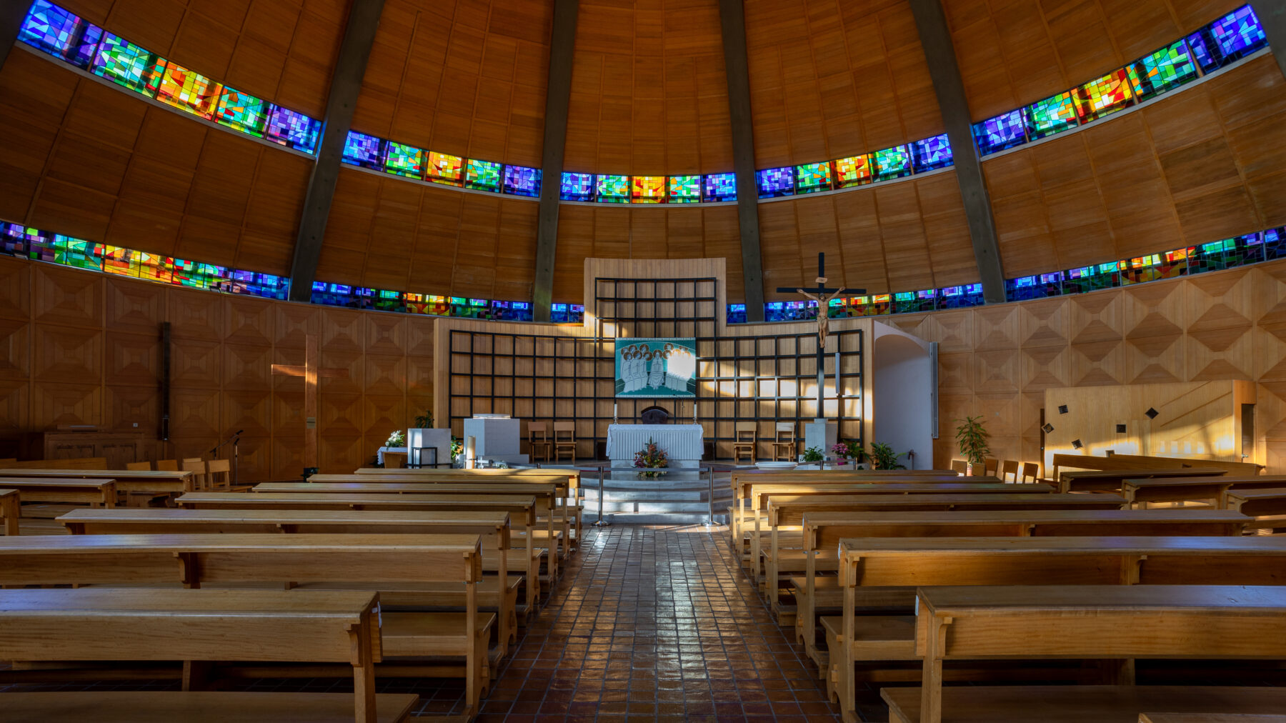
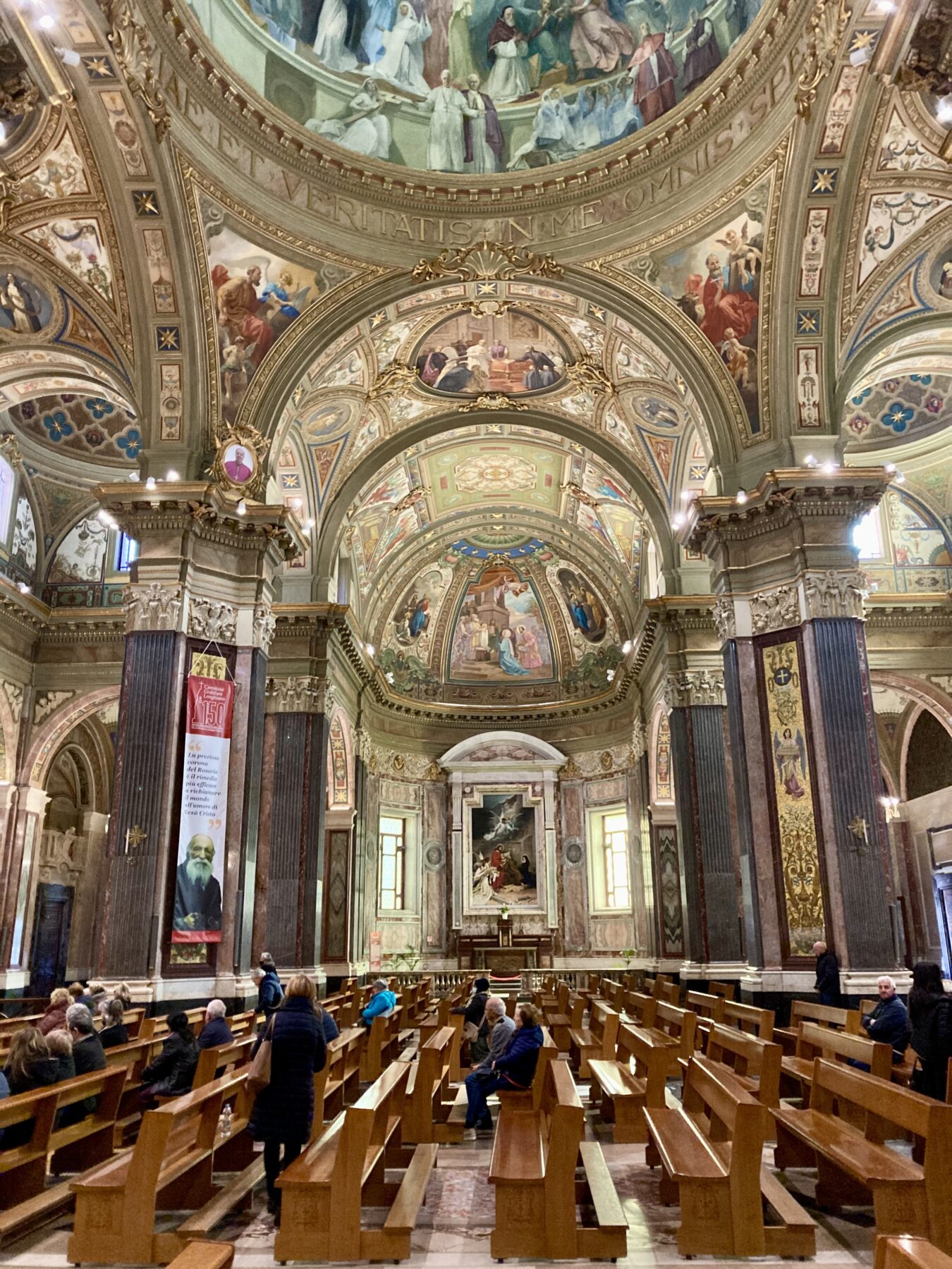
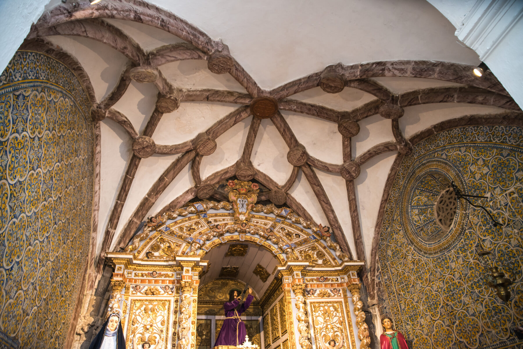
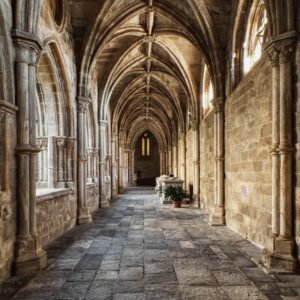
9 Churches: I chose this photograph because the photographer chose to explore non-symmetrical composition. Standing in the center isle and using symmetry produces a document, while moving off center creates more of an artistic composition. I like the use of the near right side to increase the sense of three dimensionality. Using near foregrounds can create a depth of field problem, as seen if the lack of focus on the right. The use of a tripod (if allowed) solves this problem, by allowing one to stop down to a smaller aperture. This photograph could also be improved by more contrast and increased color saturation.
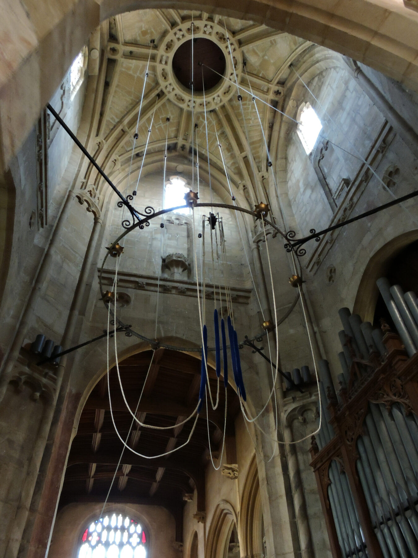
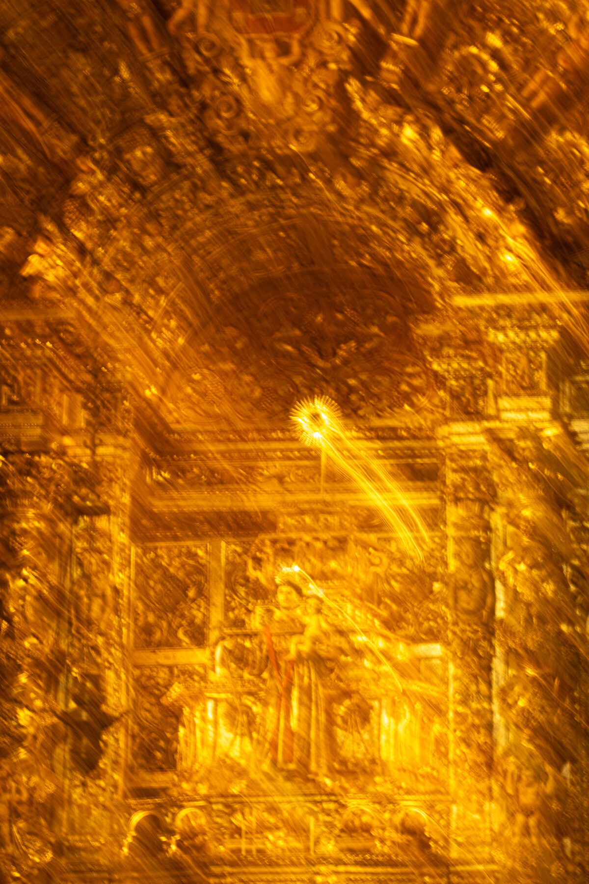
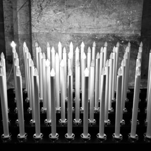
12 Electric Homage I chose this for the same reason I chose Redemption- it’s different from the rest of the photographs. I also like the choice of black and white – it adds to the graphic quality of the image. I also enjoyed the convergence of the candles. I’m a big proponent of straightening architectural photographs, but in this case the convergence of the lines add energy and movement to the composition. The photograph could be improved by darkening the top and possibly cropping it. Additionally, if the photographer shot a raw file or bracketed, the burning in of detail in the pure white candle “flames” would help.
Main Gallery