Well, we asked and again our members delivered!!
This month’s Challenge was themed “Interesting Doors” and some very interesting door images were certainly submitted coming in from 14 members.
We invited Atlanta, USA based and Award Winning Photographer, Shannon Belletti to be this month’s Guest Judge. Shannon likes to visit Portugal as often as she can as she loves everything about the country and especially the Algarve.
With such a broad theme, Shannon looked for images that showed creativity and impact/interest that went beyond what the viewer might expect. Every submitted image fit the theme well and were well executed, but these three were selections that she felt excelled in providing an interesting interpretation of the theme without straying too far.
Congratulation to all who took part and many thanks to Shannon for her time and valuable feedback that we can all use.
Our next Exhibition will be a Print Exhibition on the 29th September at the usual place and time.
We look forward to seeing you there.
Selected Images
What Shannon had to say…
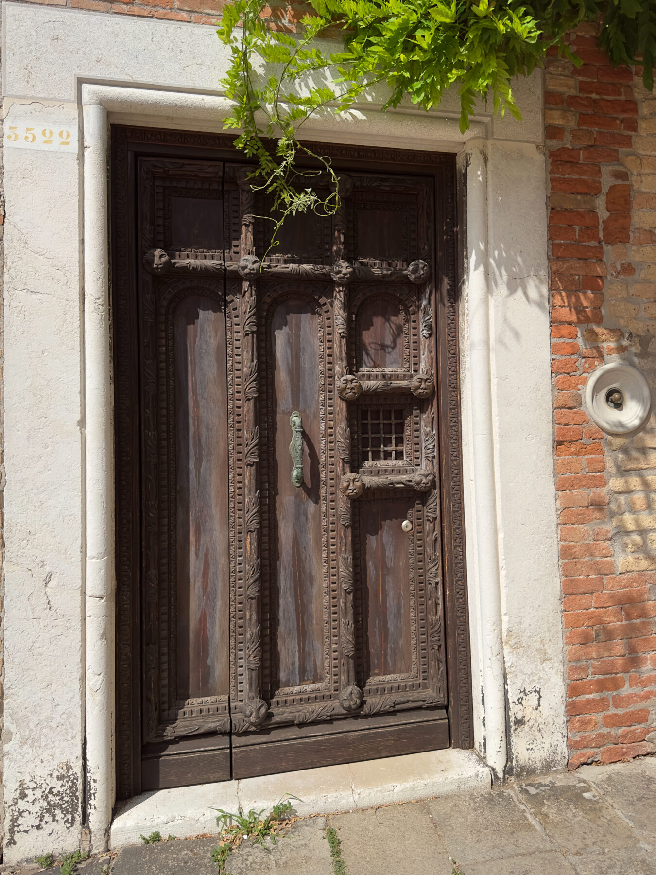
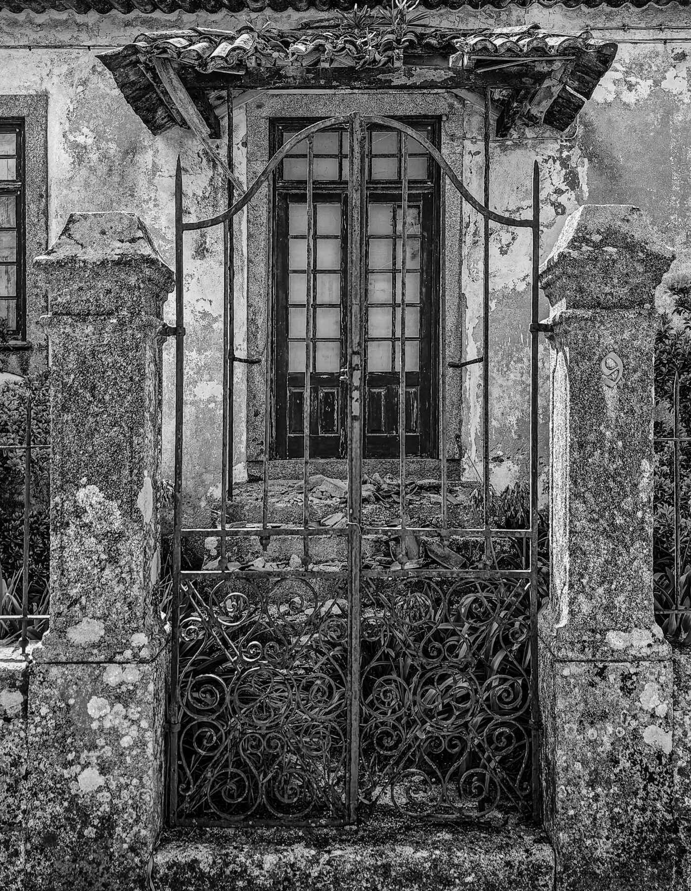
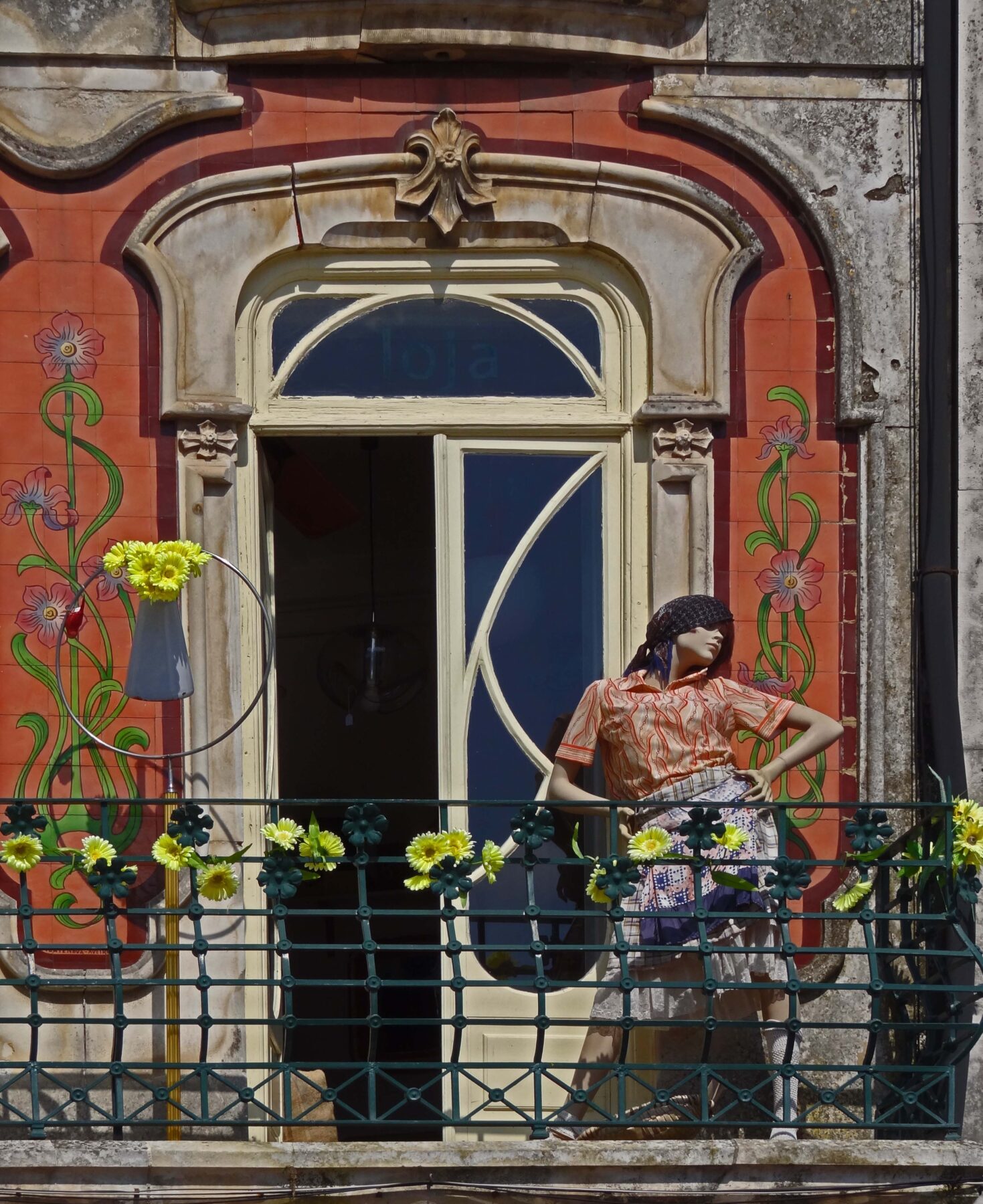
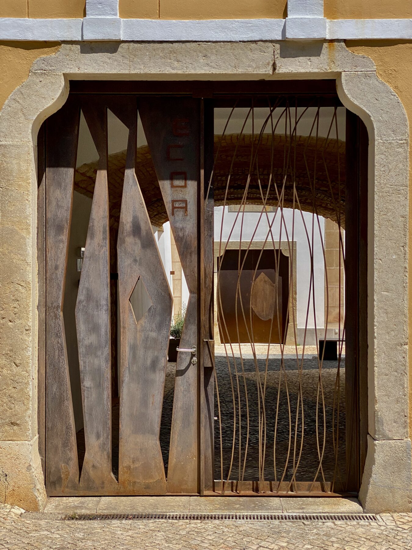
15 – New Door by Jan Tromp
Great use of many compositional techniques… complementary colors, leading lines, texture, contrasting light & dark, patterns & shapes and framing another subject. I appreciate that the vertical and horizontal lines of the outer doorway are straight and level. The photographer handled the dynamic range of bright areas and dark shadows very well with no discernible loss of detail in shadows or highlight areas. The colors work well together to create a warm and inviting image without distracting the viewer from enjoying the pattern and texture within. There’s a clear subject in the back of the image, and even though there is an object in front of it, the open pattern of the iron work creates interest without obscuring the view behind. I spent more time looking at this image than the others because there were so many elements to hold the viewer’s interest, and they all worked harmoniously together to create a scene that can be enjoyed over and over again without losing interest.
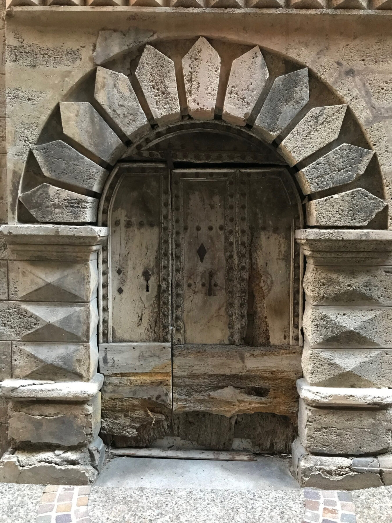
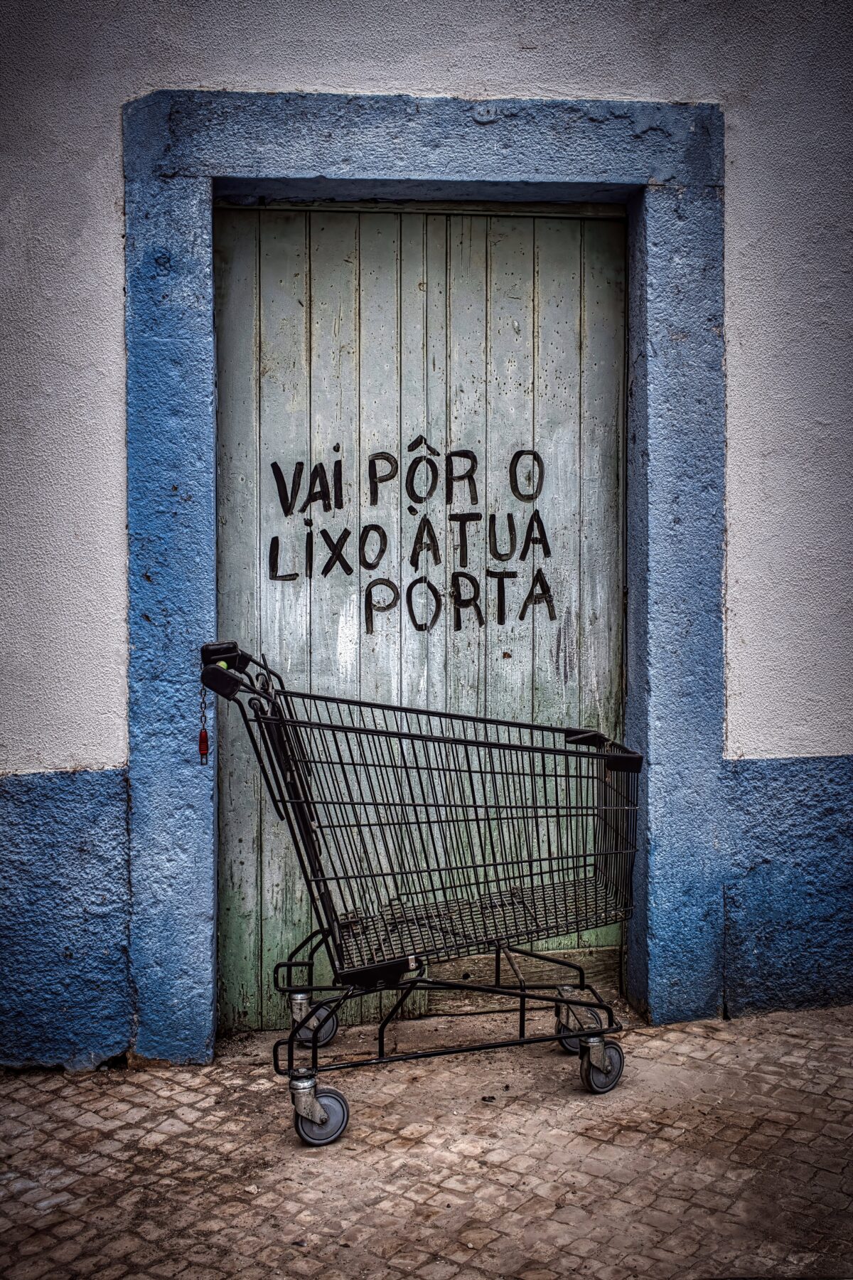
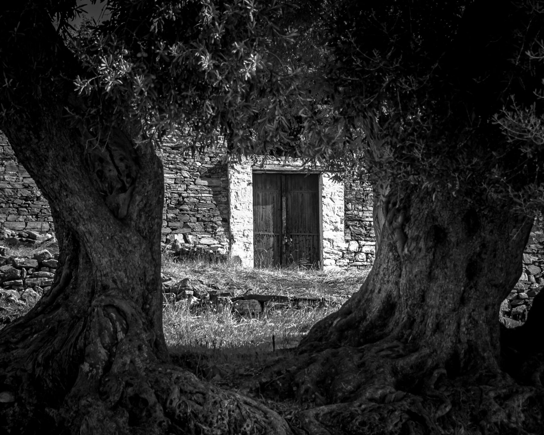
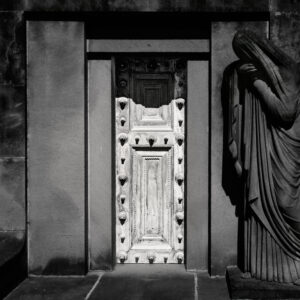
9 – Door to the other side by Robert Pool
This image tells a story, sets a mood and goes beyond a straightforward image of a door. The door itself is the brightest part of the image and is clearly intended to be the subject with its central placement. The light on the door is quite bright and contrasty, but that creates interest in the shadows created by the decoration, and gives it depth and an almost 3-dimensional quality. As the eye moves from the initial impact of the door itself, everything else in the scene speaks to the environment the door is within and the softer, darker tones evoke a somber mood. The black and white toning is very well done with just the right amount of contrast, clarity and sharpness. By keeping the outer areas softer and darker, the viewer can enjoy it without it competing with the main subject.
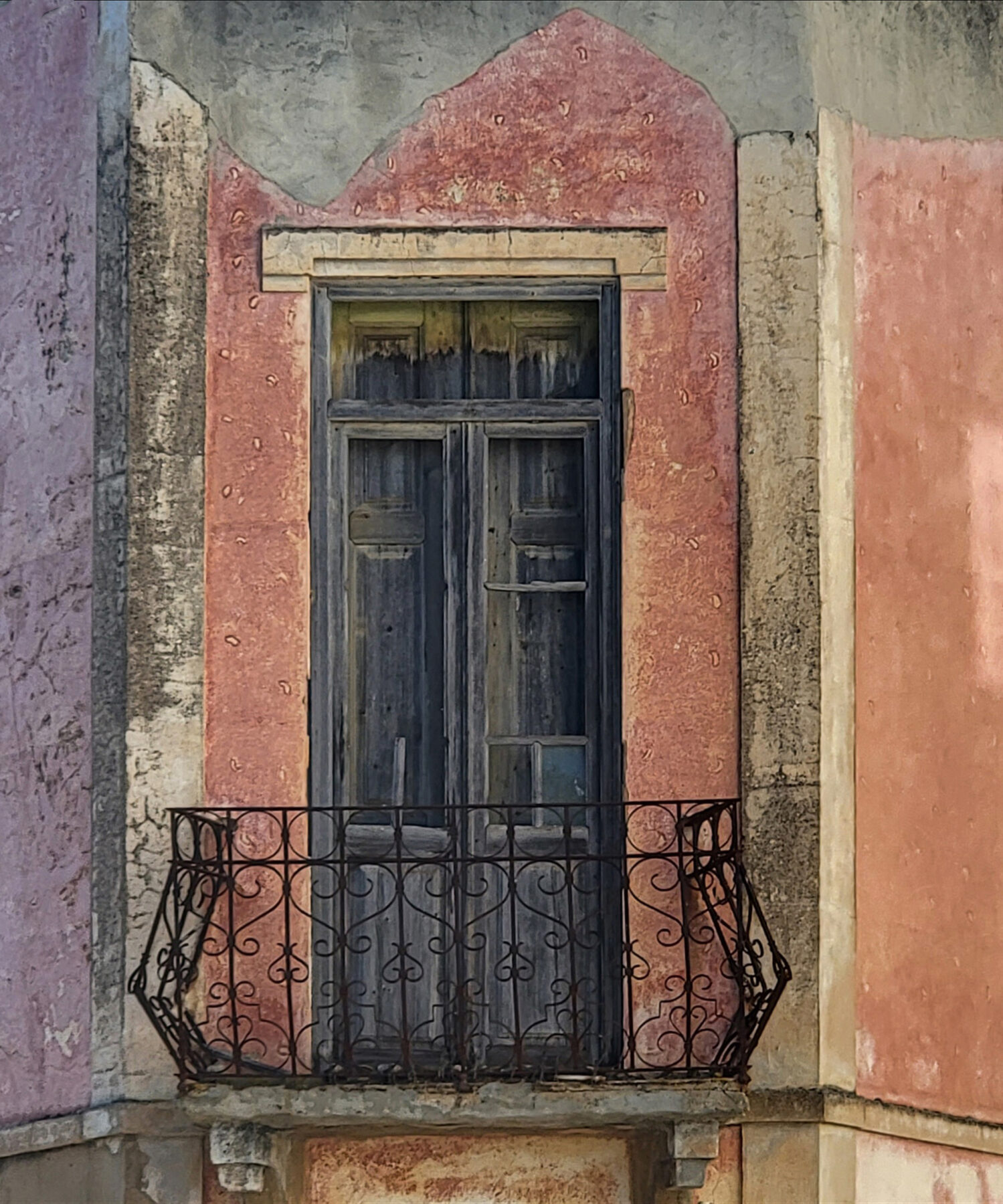
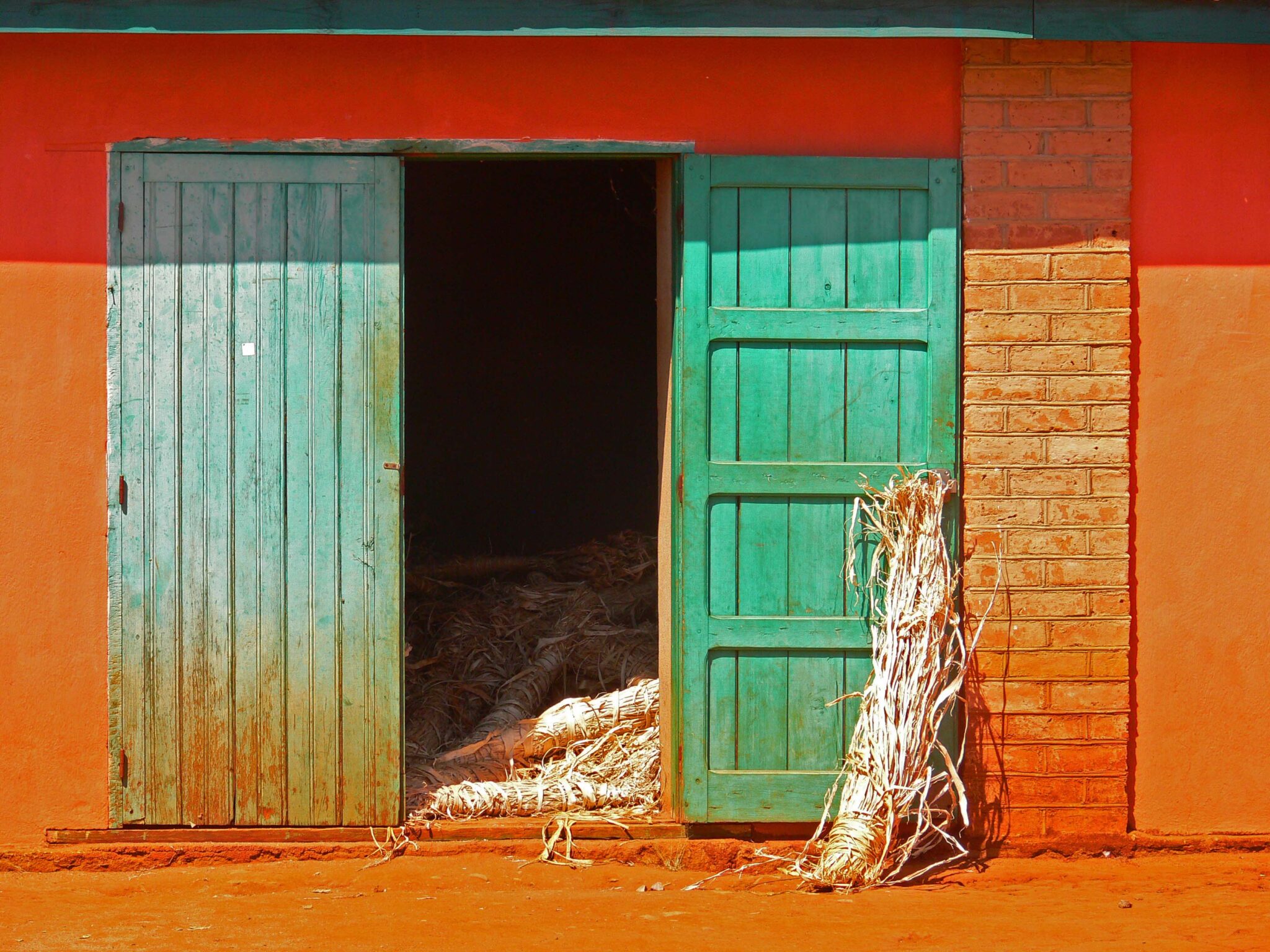
20 – Shed Door by Hubert Flasch
This photo stood out from the rest with its bold and highly effectivec use of color and texture. I particularly liked the framing of the doorway slightly off-center to include the smooth stucco wall on the right to balance the same on the left. The open doorway gives us a limited view into the space beyond with just enough light to give us a peek inside, but we’re not drawn so far in as to distract from the outer doors themselves. The sheaf propped up on the outer door also helps to inform the viewer of the environment and story and creates a focal length to help draw the viewer into the scene. I especially like the choice to include the green section of the building over the door as an effective “stop” to keep the viewer’s eye from wandering out of the photo and push them back down to the doorway itself.The dynamic range was captured well in this challenging high-contrast lighting condition… my one suggestion would be to expose for the highlights to make sure you have plenty of detail to work with there. The eye is pulled quite a bit to the brightest highlights which can prevent the viewer from exploring (and enjoying) the rest of the image fully, so if the detail is there, consider burning those highlights down just a bit.
Main Gallery