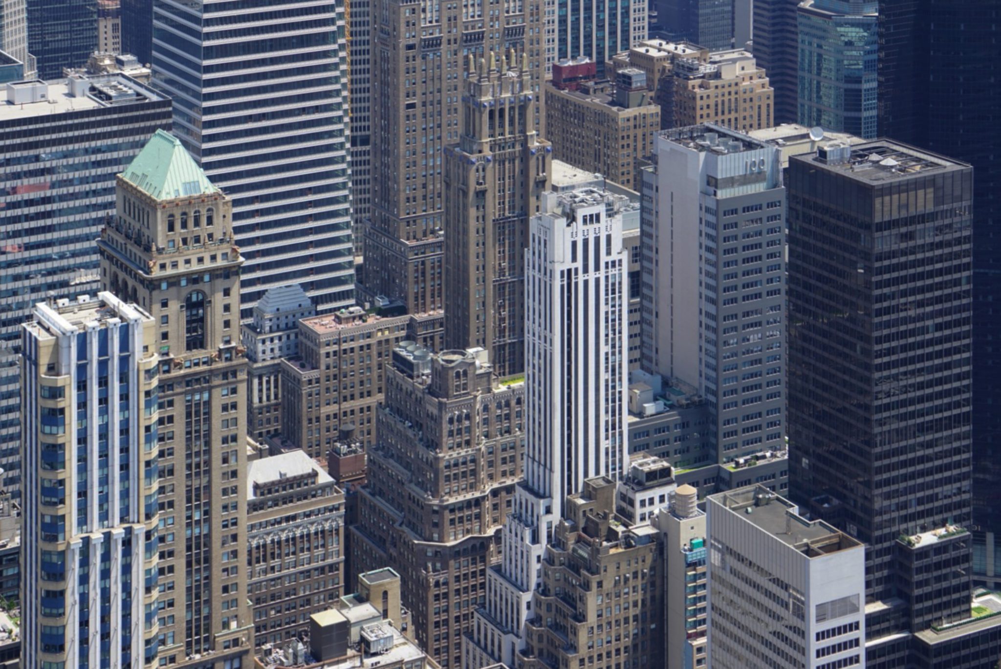
This month’s Challenge was themed “Architectural Photography” which is a more challenging topic for some.
We invited Pavel Suba to be our guest judge this month. Pavel is based in the Czech Republic and his speciality areas in photography include photojournalism and feature photography, portraits and macro. Besides technical competence, he believes that it is important to him to capture his subjects in a way that reveals something about their inner selves. His approach is very purist approach and edits images in a way that keeps the image looking natural and like a photograph rather than digital art.
More information about Pavel and his work can be seen via his website.
Congratulations to all who took part and many thanks to Pavel for taking his time to judge this challenge with an all time high submission of 44 images for selecting his favorite 3 images.
Our next Exhibition will be a Print Exhibition on the 5th April (Not March due to Easter) at the usual place and back to the usual time of 19:00. The theme for that Exhibition is “Patterns & Textures“.
We look forward to seeing you there.
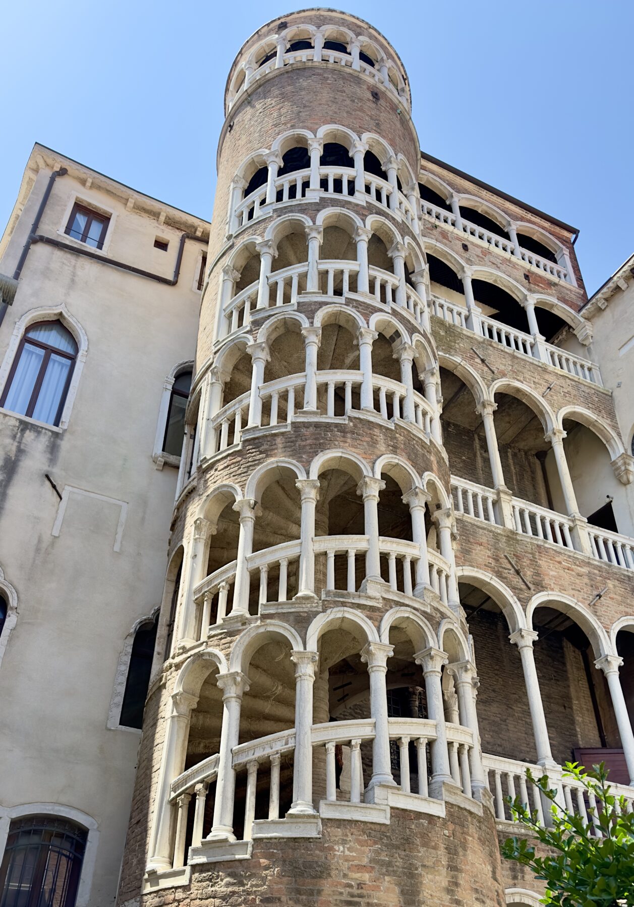
Selected Images
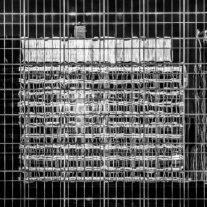
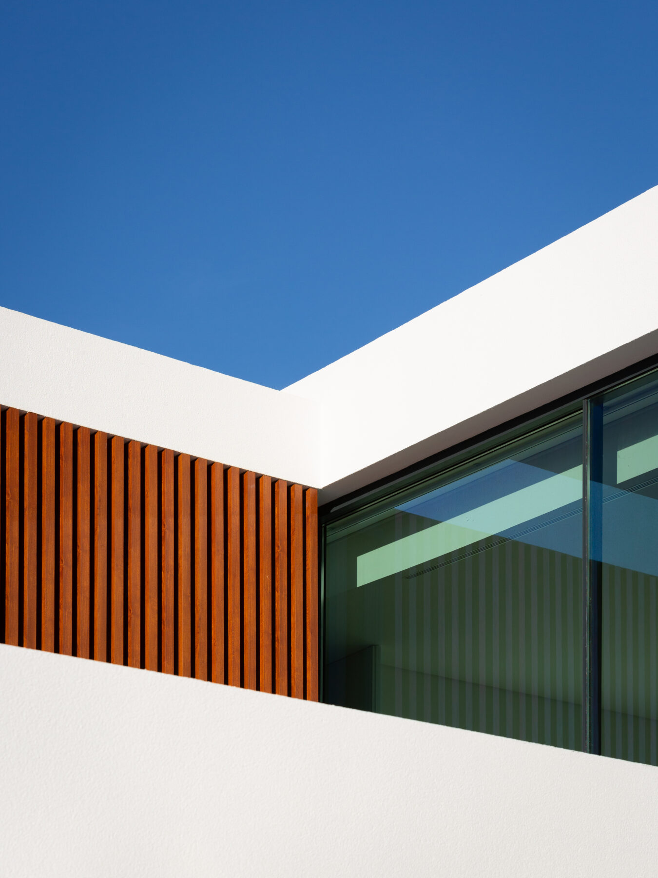
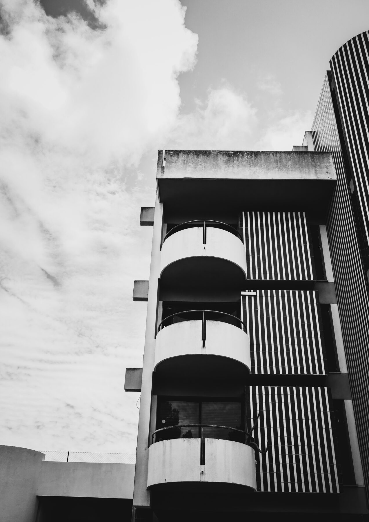
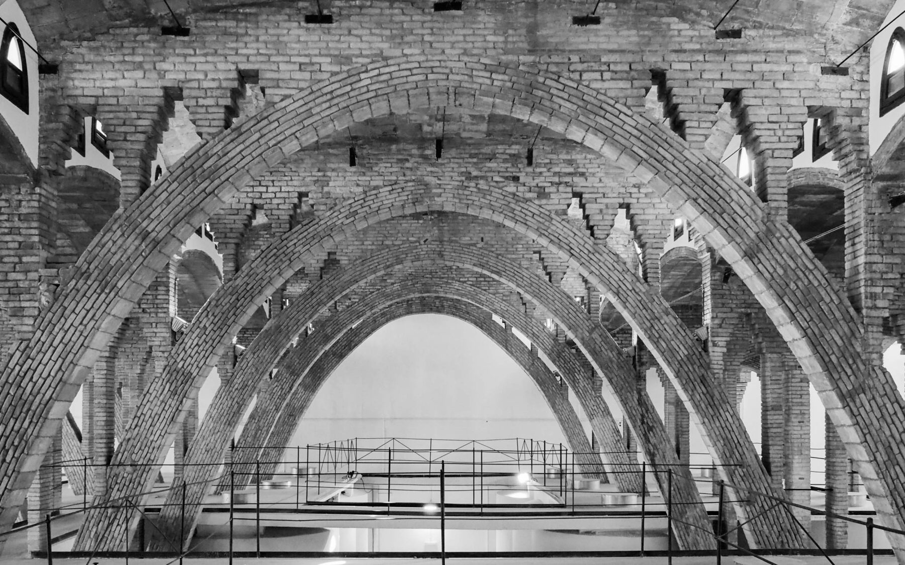
This image exemplifies to me every element a high-quality architectural image should have. The composition is very well-balanced, reminiscent of abstract art, with a fascinating array of straight and curved lines, not to mention a wide array of tones going from absolute white to black. The reflection of the facade invites the viewer to be drawn in to look more carefully and try to piece out the “original” building from the distorted reflection. Further, the technical accuracy and processing of the image enhances the viewer experience. Not only are all the lines crisp and sharp, but the carefully controlled contrast adds to the drama of the image. All of the highlight and shadow detail is retained, and there is a broad range of mid-tones.
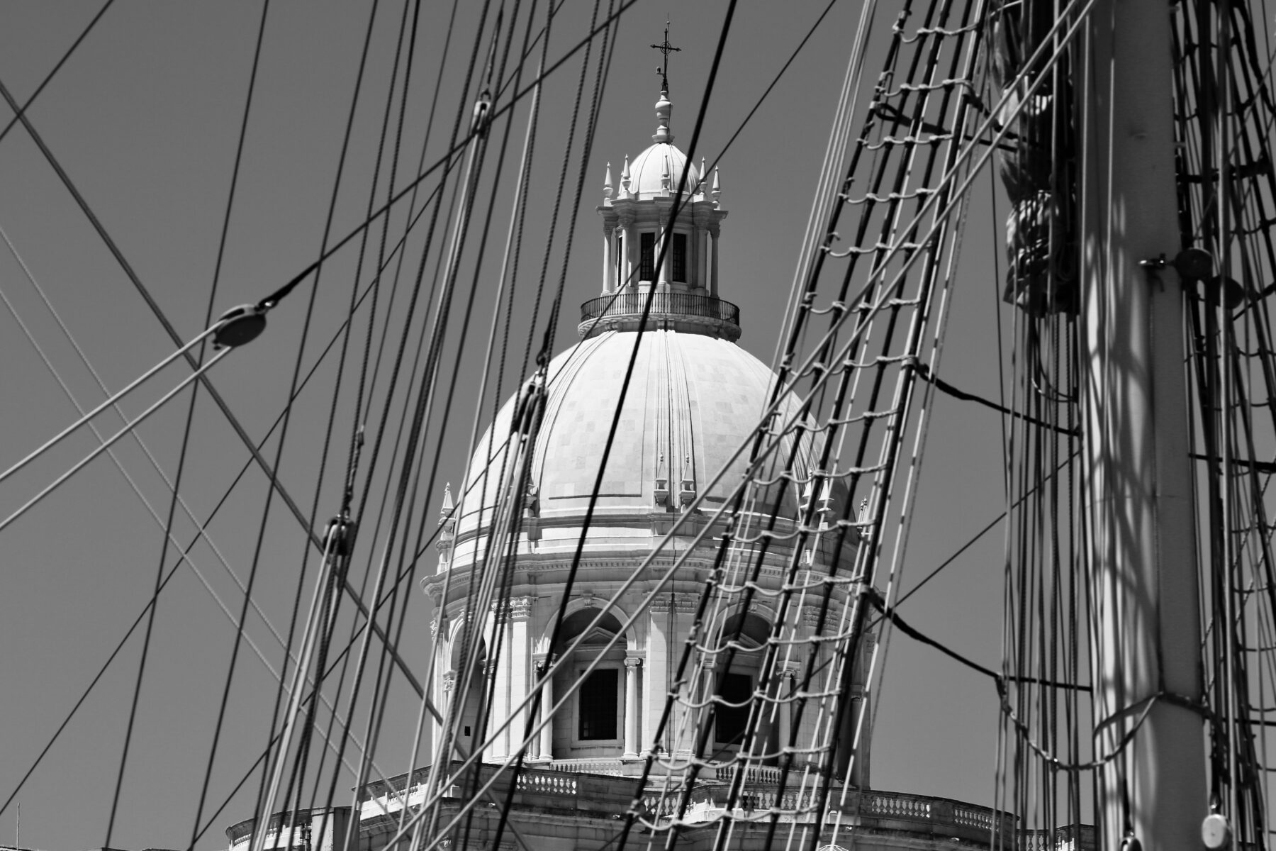
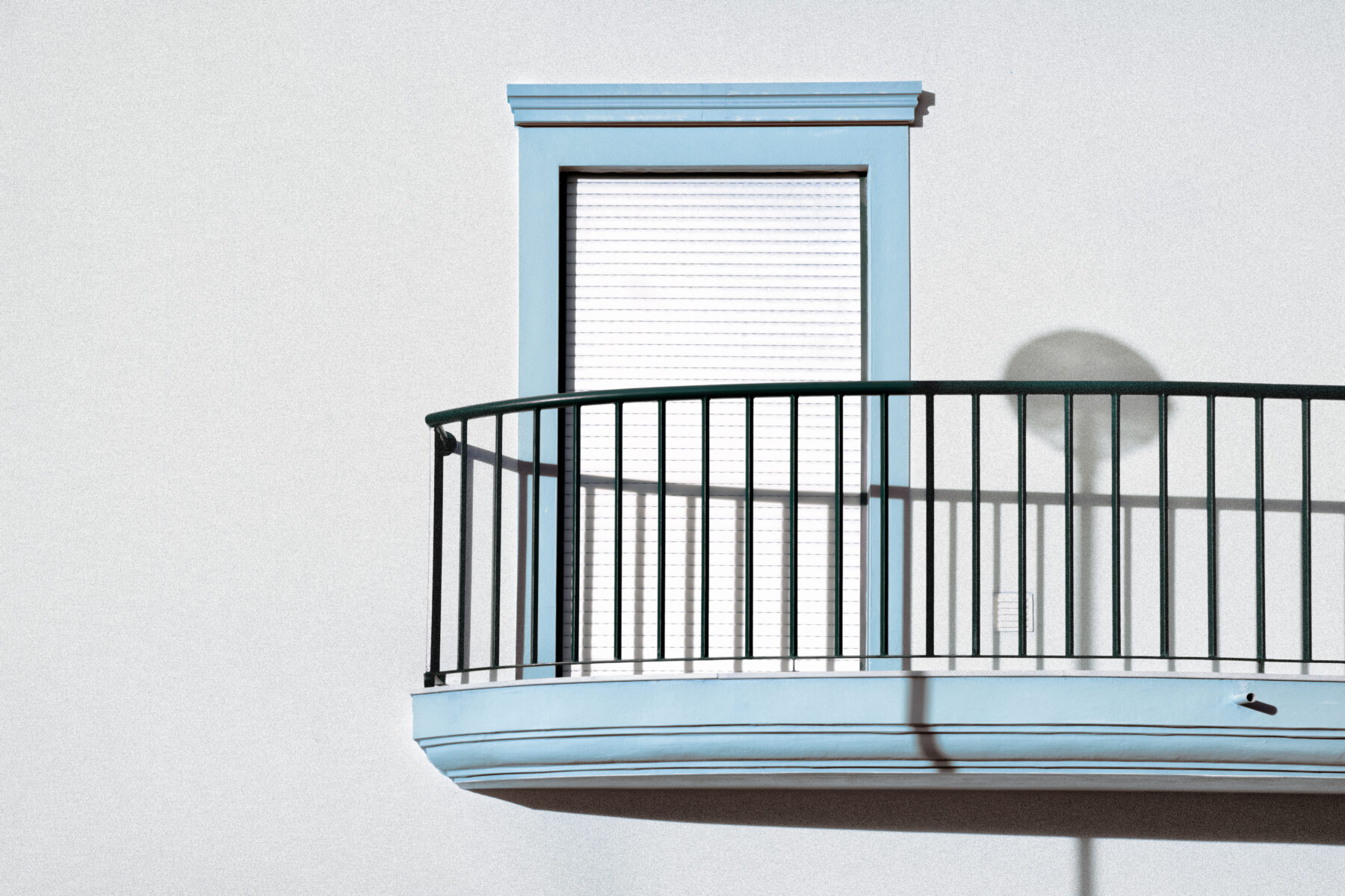
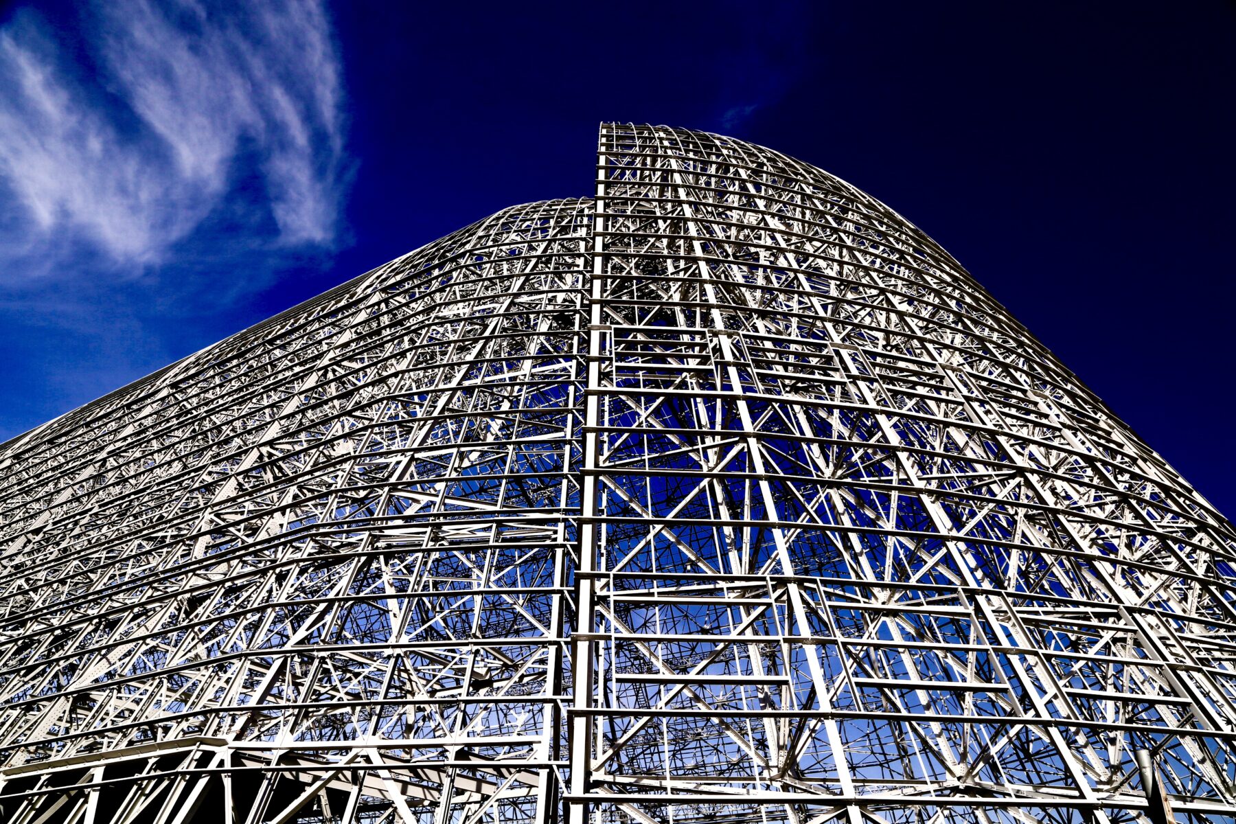
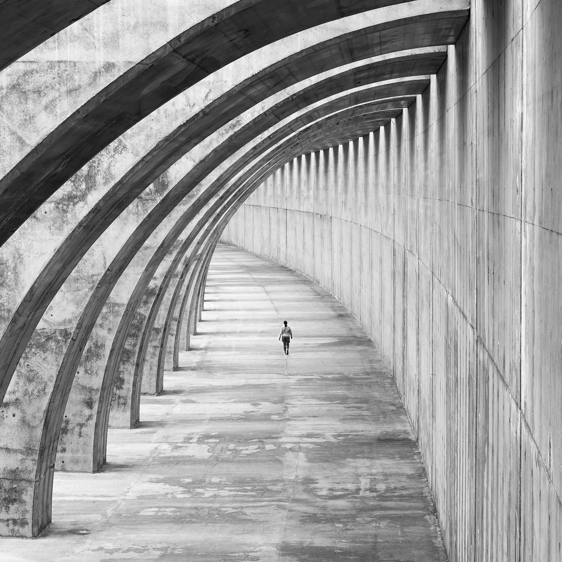
This is a fascinating image both in its starkness but also in terms of the shapes on the left, the shadows and the wind, which disturb the symmetry and enhance the composition and which make the image striking. As in the example I chose for first place, it’s reminiscent of abstract art, I appreciate the precision of the composition, with the spaces at the edges consistent, the vertical and horizontal lines all straight and parallel. Obviously, it’s not always possible to keep lines straight and parallel, but in an image such as this one, a mistake here or there would upset the balance and distract the viewer’s eye.
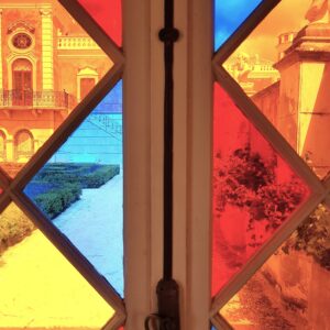
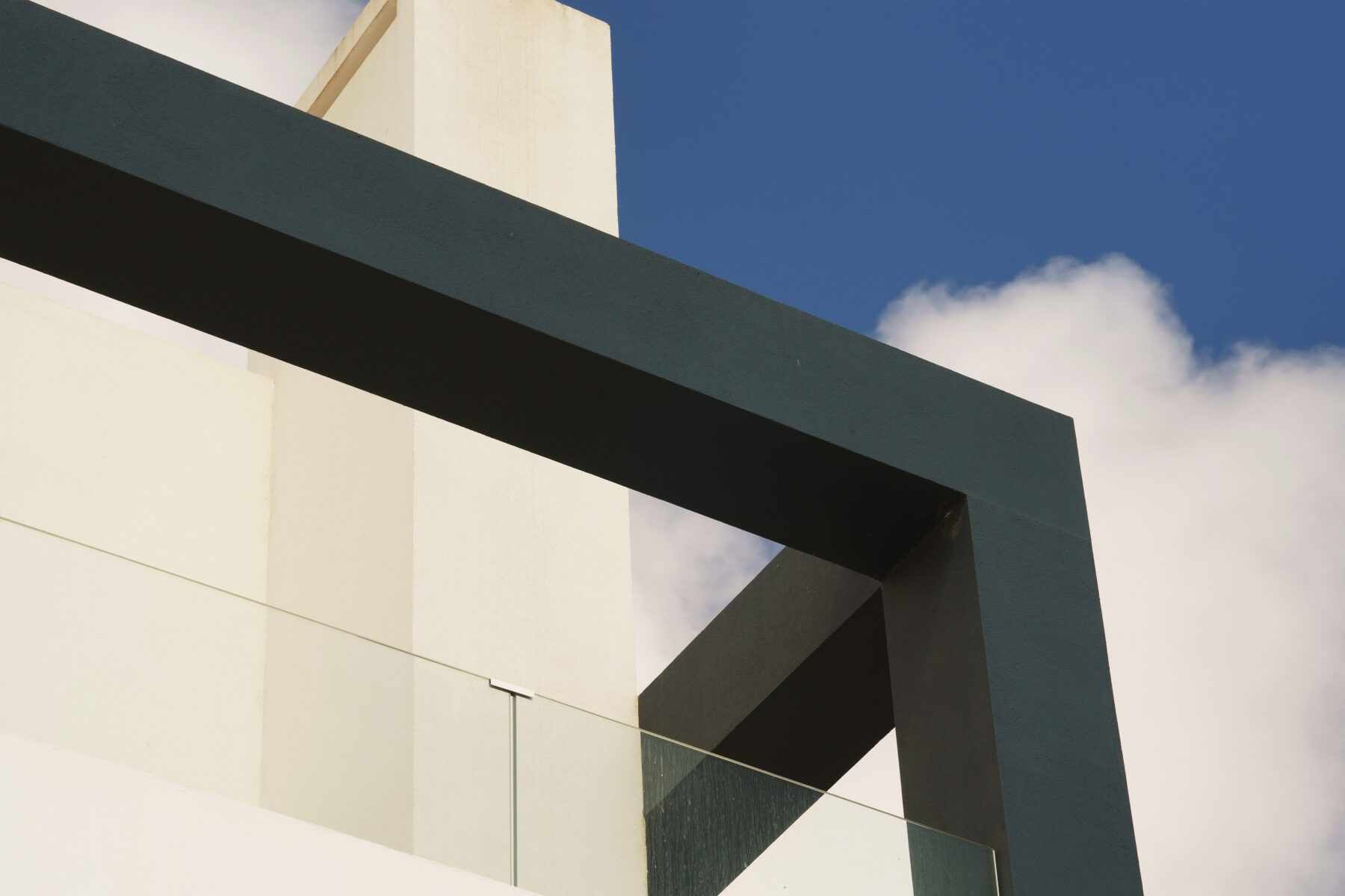
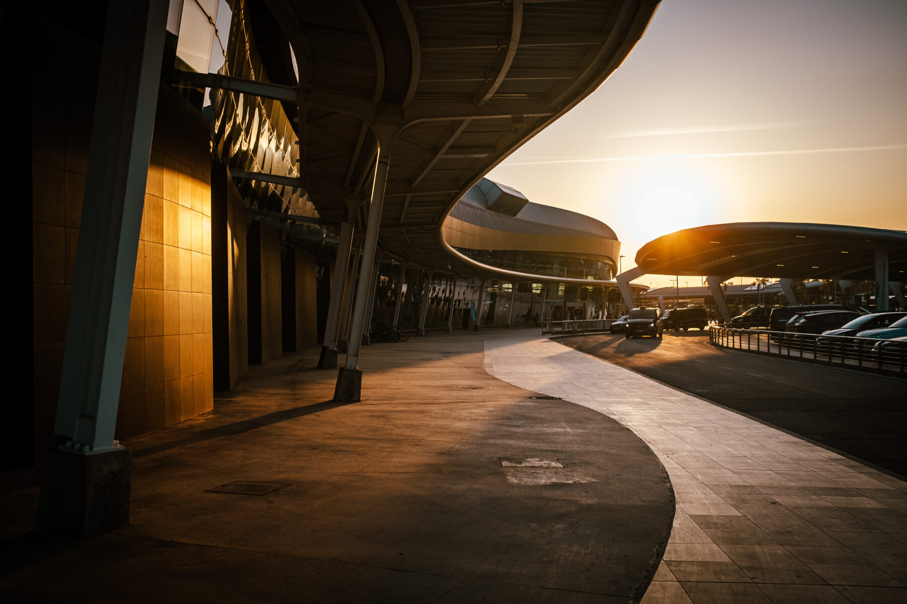
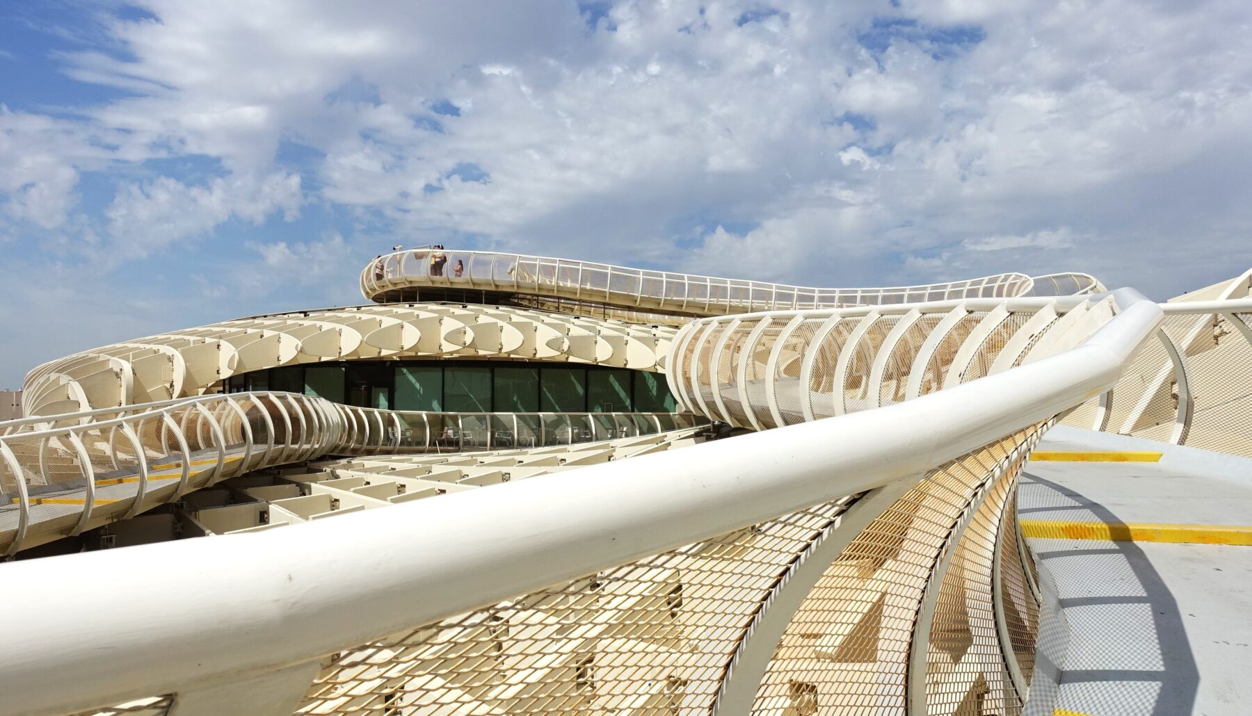
This is a very pleasing image, especially in terms of the colour scheme, with its contrasts and different shades of blues, oranges, reds and yellows. These bright colours harmonise very well together. The image also gives the viewer an interesting array of textures, shapes and things to view. In the individual panes, there’s an interesting assortment of sharp architectonic features and patches of texture in various levels of sharpness, such as the flowerbeds/shrubbery and bare patches of colours, which give the overall composition a pleasant balance. Further, I also like the fact that certain shapes, especially diagonal lines, are echoed.
Main Gallery